Visual analysis - the art of illuminating and clarifying statistics Vicki Lee's and my
travels to Paris and London helped get some state
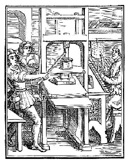
buildings efficiently located in downtown Sacramento! The subway maps from those cities show the routes
in different colors. This inspired the map shown below that I created
when the state was planning to consolidate its office
buildings in the downtown Sacramento area in the
most environmentally friendly manner. I showed each
bus route into the downtown area in a different color.
Regional Transit administrators at the time did not
want to use my concept of multicolored routes into
downtown because they were worried that it would
seem that light rail was not being efficient. I had
to obtain special permission to work after hours
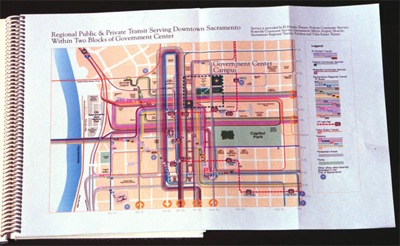
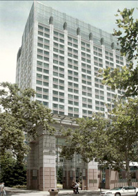
on my own time to create these maps. This map was combined with my ranking of each site by the number of times bus or light rail stopped during each day within three blocks of each proposed site. The map demonstrated the layouts so anyone could locate and track them. This grew out of my full time job creating the bus and light rail schedules. At the time I was working in the marketing department at Sacramento Regional Transit - the agency should have had similar analysis being done through their planning department - so my work was presented as coming from the Environmental Council of Sacramento. ECOS received a commendation from the City Council for my work in this process. My graphic piece and ranking was incorporated in many of the multimillion-dollar project proposal documents for those sites that rated near the top. I allowed everyone to use my work gratis. The first two buildings were constructed on two of my top three ranked sites. Parking was impossible for site number one. The photograph below on the right is of the California EPA building that was number 2 in my analysis, and the first site built upon. My analysis and graphics done in the public interest carried the day and helped change the face of Sacramento.
Sometimes I played the role of an art director. I have always been happy to work with any artists. Creating effective work that accomplishes a goal is the purpose of what I do, it does not matter to me who does it. We each have different talents. I have never been able to draw, but I have other talents. Because much of the work I have done in my life is for nonprofit organizations, and often I am not getting paid for my work, others are often very willing to pitch in to help the good causes.
 ccc
ccc 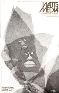 Cccaicl
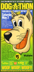
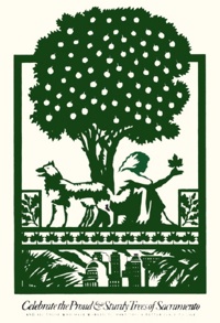
Caitlin Rivers's beautiful poster for the Sacramento Tree Foundation For many years as a founding board member I voluntarily designed materials for the Sacramento Tree Foundation. Finally one year they had received enough money through fundraising to pay for some original art for an event poster. You see it above on the left. I immediately commissioned respected local Sacramento artist Caitlin Rivers, and promised her the money. As was the custom, I asked her to provide three sketches and I chose one which she worked up in more detail. I brought a proof of that more final draft poster to a Tree Foundation board meeting. The man who was then the new chair of the Board at that time led the Board to reject the art as somehow inappropriate. He made some snide joke about the art, which inwardly infuriated me, since Caitlin had created a profound and beautiful piece. Overnight, I created another poster with mostly type on it and printed Caitlin’s beautiful image on the back. And still paid her the $300!
The Watts Media Center poster art was created by Angela Perkins when she was a student at the federally funded training program I was teaching at in 1966 soon after the Watts riots in Los Angeles in 1965. She had created a much more complex piece that I cropped to focus on the beautiful dynamic part you see on the poster. Angela was an obviously talented person who had attended an art school previously. She said that the work with us helped her apply for and obtain a job with the local branch of one of the largest advertising agencies in the country, Young and Rubicam.
Larry Seddon's happy poster Larry and I were fellow employees at Sacramento Regional Transit. I don't know what his job was, but occasionally he would share with me very beautiful and incredibly detailed drawings he would make of buildings in Sacramento. My sweetheart Betsy was volunteering for an organization that assisted people who are blind. A fund-raiser was coming up and she needed a poster for an event to benefit dogs who would be walking around the California State Capitol. Larry volunteered the beautiful drawing of the happy dog and I played about with it, fitting it small with all the text. Finally I had the inspiration to make it large and become the dominant visual element on the poster. It takes a while for good ideas to manifest themselves.Larry
The complicated diagram below helped focus Sacramento officials on fixing levees.
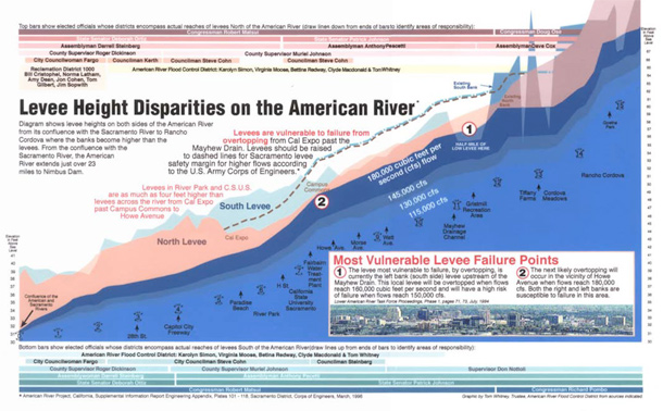 It It It took me three months of volunteer time to create this diagram from many huge three- by four-foot topographic maps created by the U.S. Geologic Survey that showed only short few-mile lengths of the American River and each map showed levee height only on one side of the river. No one had put them together to determine the relative heights across the river. As a newly elected Trustee of the American River Flood Control District, I felt that this was essential information. I completed the diagram finally just in time for a meeting of the Executive Committee of the Sacramento Area Flood Control Agency. I just started explaining it as Muriel Johnson, Chair of the SAFCA Board and a Republican, came into the room and sat beside me. When I explained that the diagram showed - in that circle with the 2 - that voters in her district on one side of the river had levees four to five feet higher than people on the other side of the river, she instantly became an advocate for fixing the levees before constructing Auburn Dam, that was a favorite of Republicans. This was a huge victory for environmentalists. She later went to Washington, D.C. and helped lobby to fix the levees.
Why keep things simple when you can make them complicated? This is my tongue-in-cheek response to some observations that have been made about my work at times. Kirk Marckwald observed ruefully that I can get more information per square inch than anyone he has met. For some reason I do like complex pieces of art. My first big piece was the commemorative poster for the start of the light rail system in Sacramento that you see below.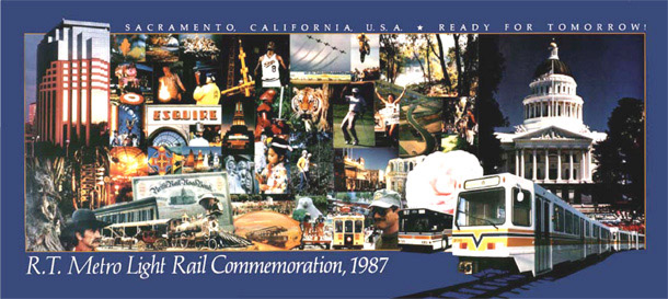 Showing the complex personality of Sacramento was my aim with the poster. The photographs show the history, lifestyles and aspirations of Sacramento County. Simplicity was not my style at the time. I went to all the local professional photographers and looked through their slide collections, picked 65 good ones, paid them their going rates for stock photogrphs, and pieced it together, slicing the prints like a surgeon, print by print, and pasting it on the mounting board with rubber cement. It is the kind of project that would be relatively easy to accomplish with computers in 2005, but was much more a hands-on craft project then. For many years it was displayed in the City Council waiting area. It shows the capitlal city of the seventh largest economy in the world.
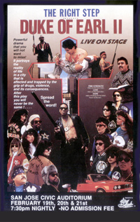
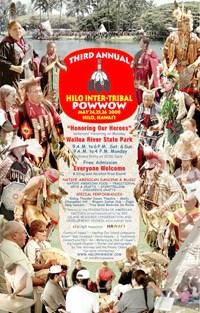
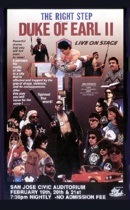
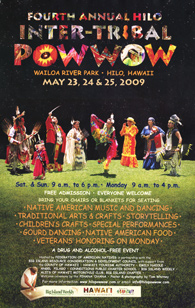 Most of My aim with these was to show that there would be excitement and many things going on at these events. The Duke of Earl was a gripping stage performance aimed at scaring young audience members to stay away from drugs. It was produced by my son Julien shown in the lower right. The posters for the Hilo Inter-Tribal Powwows were fun and a challenge, because each person had on native regalia that depicted their tribe with great dignity. But when photographs were taken there were so many colorful people in the background that each person's distinctive identity was lost. The poster on the right shows how I cut out each person completely from the background and put a starry sky behind them and grass in the foreground. I thing this was my best solution. It does not qualify as photojournalism - but what it does accomplish is to show each person off as if they were on stage, that is, you see them in full dignity without background distractions. Here, as you can see, I used photographs of native regalia in the background of the letters.
Many photographs of average quality were combined to make something special
Graphics helped make potential depth of flooding more understandable
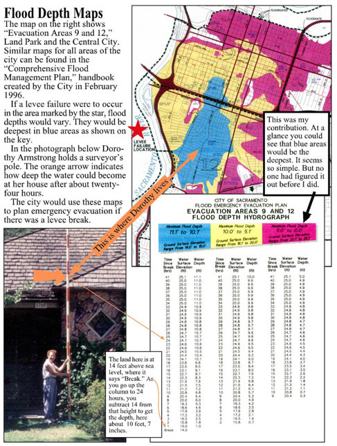
Creating the deceptively simple graphic above took months. I consulted all the fascinating books by renowned author Edward Tufte to no avail. I came up with sketches and visited flood engineers to review them and ask for assistance, and didn't find any. Nothing was clicking, until finally one day after many months it fell into place so simply. The City of Sacramento thought it was a great addition to the flood maps and incorporated the diagrams into all the new comprehensive flood maps they were creating. I asked the City staff to grant me credit in the front of the document as a consultant to the City of Sacramento's Comprehensive Flood Control Plan plan along with their other consultants. They did not pay for my effort, but it was professional service of good caliber that I felt deserved the credit. I later used that as one of my qualifications when I ran for a public flood-control office and won.
These skills provided my bread and butter for a lifetime. I started out in printing, at first with moveable type and an old small letterpress. I would often visit the Special Collections Department at the UCLA Library where I worked and look at early examples of printing including pages from the Gutenberg Bible and works by William Caxton, one of the earliest English printers. This gave me an appreciation of classical typography that has never left me. Then I moved on to the emerging field of small offset printing in the 1960s. I started working for Welton Beckett, a big architectural firm, and started creating typographic forms with my moveable type while i printed forms for the firm on a Multilith small offset machine. The job I had then has been replaced by the fancy new Xerox and other machines that you see in offices today that print both sides, collate and staple the work - and even print in color! Then I got a job using large moveable type making signs for Vomar Products, which has since become a hot multi-million dollar firm. Paul Van Ostrand, a fine graphic designer and practical man, taught me much about the graphic design profession by his example. I figured a graphic designer could produce anything that had type on it, and I have since created quite a few things through the years. I left Paul, went to UCLA full time to become a philosophy professor, and worked at night doing printing and starting a family. I also ran a pioneering project to have students evaluate their learning experience, that ended up rating teacher effectiveness. But school had to drop drop by the wayside as my practical philosophy was to support my growing family, and so I continued with printing and some designing to make some money for a number of years. My first wife Elvie's passion to become a playwright came to the fore and I started designing posters for her and other artist friends printing them after hours at various printing companies where I worked. The arc of my working life went from printing to sign making to teaching to editing and designing and editing a national magazine to to designing publications for the California Governor's Office of Appropriate Technology back to teaching then to graphic design and finally to to writing.